A modern camera takes a fraction of a second to turn what its sensor sees — a single-channel grid of grey values with almost no contrast — into the photograph that lands in your camera roll. The pipeline that does that work is called an image signal processor, or ISP. On a phone it’s a dedicated chunk of silicon next to the GPU; on most mirrorless and DSLR cameras it’s firmware running on the camera’s main processor. Either way, the same handful of conceptually distinct steps sit between those greys and the final image. None of them are exotic, but together they’re the difference between an array of numbers and something your eye accepts as real.
This post walks each step in turn. Not as a checklist, but as a sequence of fixes: each stage of the pipeline corrects one specific way the previous representation fails to look right.
1. What the sensor actually sees
Pull a RAW file straight off a camera and look at the data the sensor actually recorded — before any reconstruction, balancing, or display encoding. It’s a single channel: every pixel a number, no colour anywhere. Rendered as greyscale, it looks exactly like a black-and-white photograph:

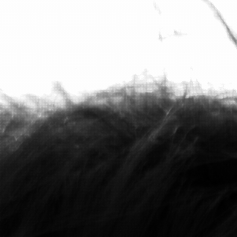
Each photosite on the sensor sits behind a single colour filter. A red filter blocks most of the green and blue light hitting that site; a green filter blocks red and blue; a blue filter blocks red and green. So every photosite records a single brightness value, and that value reflects only one of the three colour channels at that pixel location. The right-hand crop above is the imprint of those filters: each visible pixel responds only to its filter’s wavelength range.
The arrangement of the filters is a colour filter array (CFA). It’s invisible at full-image scale because the per-photosite differences average out across any reasonable display resolution; it becomes obvious only when you zoom in.
What if you took the raw data and just put the colour channels back together — group each photosite by its filter, fill in the missing values via simple interpolation, present the result as RGB? That’s the simplest possible reconstruction. It looks like this:

Two things are obviously wrong. The image has a heavy green cast — strong enough to throw off skin tones in particular. And the contrast is flat, with bright areas blown out and shadows muddy. The next sections explain why each of those failures happens, and what fixes it.
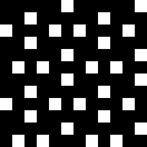
2. Why the image looks like noise: the colour-filter mosaic
The simplest case first. Imagine pointing a camera at a perfectly uniform red wall. What does the sensor record? It depends entirely on which photosites have a red filter — those are the only ones that respond.
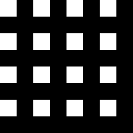
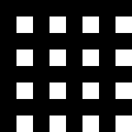
Most cameras use the Bayer pattern: a 2×2 tile, repeated across the entire sensor.
$$ \text{Bayer:} \quad \begin{pmatrix} R & G \\ G & B \end{pmatrix} $$
Why two greens and only one each of red and blue? Because most of the perceptual information in an image comes from green. The human eye’s sensitivity to brightness peaks in the green-yellow part of the spectrum, around 555 nanometres, and the Rec.709/sRGB definition of linear luminance reflects this:
$$ Y = 0.2126 \, R + 0.7152 \, G + 0.0722 \, B $$
The green channel carries over 70% of perceived brightness. Detail — the high-frequency information the eye uses to judge sharpness — comes predominantly from green too. Doubling the green sampling rate captures the perceptually-important content at no extra photosite cost. Red and blue are sampled at half-density because that’s where the eye is least sensitive; mistakes in the reconstruction there hide more easily.
Under three flat scenes — pure red, pure green, pure blue — the response patterns are:

Fujifilm’s X-T5 — the camera that captured the image in §1 — uses a different pattern: X-Trans IV, a 6×6 tile that keeps Bayer’s red/blue symmetry and goes even greener (8 red, 20 green, 8 blue out of 36 sites — ~56% green versus Bayer’s 50%), for the same luminance-sensitivity reason, but with the colours distributed irregularly across the tile.

Why two patterns? Bayer’s regularity makes the demosaicing arithmetic simple, but it also produces predictable artefacts — moiré and false colours along high-frequency edges, because aliasing of a regular sampling grid with a regular scene pattern is exactly the kind of thing Nyquist warned about. X-Trans’s irregularity diffuses those artefacts at the cost of more involved demosaic algorithms. Both pay the same 2-in-3 information cost: every photosite still records only one of the three colour channels.
The mosaic crop in §1 is what these patterns look like under a real, unevenly coloured scene. Every pixel that looks bright is bright because its particular filter colour was bright in the world at its particular pixel. Every pixel that looks dark either saw little of its filter’s colour, or saw little light at all.
The remaining sections are about reconstructing a colour image from this single-channel grid.
3. The chain of fixes
The signal goes through seven conceptually distinct steps between the photosite and the photograph. Each one addresses a specific way the previous representation falls short of being a usable image:
- Digitisation — analogue charge to integer code.
- Linearisation — establishing the domain in which corrections are mathematically meaningful.
- White balance — fixing the colour cast.
- Demosaic — reconstructing the missing two-thirds of each pixel’s colour.
- Colour correction — mapping camera-native RGB to standard sRGB primaries.
- Tone mapping — compressing scene dynamic range to display range.
- Gamma — encoding for human perception and display.
The next seven subsections walk each in turn, with a real before/after where the failure mode is visible.
3.1 Digitisation
Sensor output starts as analogue charge — photons knocking electrons loose in each photosite’s well, integrated over the exposure. An on-chip analogue-to-digital converter (ADC) maps that charge to an integer code value, typically 12 to 14 bits per photosite on consumer cameras, so values in the range $[0, 4095]$ or $[0, 16383]$ before black-level correction. The output is linear in scene radiance: doubling the incident light roughly doubles the recorded code, up to where the photosite saturates.
For everything that follows, the ISP almost always rescales those integer codes into floating-point values in $[0, 1]$ — 0.0 is the black level, 1.0 is sensor saturation. Subsequent stages don’t have to know what bit depth the ADC actually produced; they all work in the same normalised range. Every equation in the rest of this post — the WB gains in §3.3, the Reinhard curve in §3.6, the gamma transfer in §3.7 — is written for values in $[0, 1]$ for that reason.
This step is invisible from outside the sensor. Every RAW file you’ll work with is already digitised; the bits are what you see. The ISP’s job starts at the next stage, with linear normalised data already in hand.
3.2 Linearisation
The goal of this step is to ensure the data downstream is linear in scene radiance: doubling the incoming light doubles the recorded value, tripling it triples. That property is what makes physically meaningful operations — scaling channels for white balance, exposure compensation, multi-frame HDR merge, sensor calibration — produce the answer they should.
For some sensors there’s nothing to do here. The Fujifilm X-T5 RAF format used for the figures in this post is straightforwardly linear straight off the ADC, so this step is a no-op. For others — especially smartphone sensors, where bit-budget pressure is severe — the sensor applies a piecewise-linear, square-root, or log-style companding curve on-chip to fit a wider dynamic range into fewer bits.
The shape of the curve isn’t arbitrary. Human vision is far more sensitive to small intensity differences in dark regions than in light ones — a pair of shadow tones one stop apart looks visibly different, while a pair of highlights one stop apart looks essentially identical. The companding curve exploits that asymmetry: most of the bit budget goes to the shadows where the eye can resolve detail, the brightest stops are squashed together because the eye can’t tell anyway, and the curve interpolates smoothly between the two. (The same perceptual asymmetry drives gamma encoding in §3.7 — same reason, different point in the pipeline.)
The recorded codes are no longer proportional to scene radiance; reading them directly gives a perceptually-adjusted but radiometrically wrong signal. The fix is a single look-up table or closed-form inverse of the companding curve, applied as the first thing the ISP does — so everything downstream sees data with the linearity it expects.
Most of the rest of the pipeline either operates on that linear data or deliberately breaks linearity. Knowing which side of that boundary the data is currently on is half the battle: any operation that says “this is twice as bright as that” has to happen while the data is still linear. The next step, white balance, is the canonical example.
3.3 White balance
White balance (commonly used by its abbreviation, WB) is the simplest operation that depends on linearity. The model is per-channel gain:
$$ \begin{aligned} R’ &= g_R \, R \\ G’ &= g_G \, G \\ B’ &= g_B \, B \end{aligned} $$
The gains $g_R, g_G, g_B$ come from the camera’s auto-white-balance metadata — the camera estimates the scene illuminant during capture and records what would neutralise it. A warm indoor light (low colour temperature) leaves blue under-represented, so $g_B$ has to lift it; tungsten light needs $g_R$ pulled down. A common simple alternative is the grey-world assumption: average each channel across the scene, scale so the averages match.
The non-trivial part is when in the pipeline this multiplication happens. Apply it in the linear domain — before tone mapping, before gamma — and the image looks neutral:

Apply the same gain values after gamma encoding and the image picks up a colour cast:

The general principle: any operation whose mathematical meaning depends on linearity — anything that says “this is twice as bright as that” — has to happen while the data is still linear. Tone mapping and gamma both deliberately break linearity. After they’ve run, scalar gains are no longer scalar gains. Numerous bugs in image-processing code come from forgetting which side of the gamma boundary the data is currently on.
3.4 Demosaic
Each pixel reads only one of ${R, G, B}$. Every pixel needs all three. Demosaic is the reconstruction step — interpolate the missing two channels at every photosite using the values from neighbouring same-colour photosites.
The simplest possible algorithm: linear interpolation. For each missing channel at each pixel, average the values of the same-coloured nearest neighbours. Cheap to compute, but visibly wrong along high-frequency edges, because the same-colour neighbours don’t see the edge at the same sub-pixel offset. Better algorithms — adaptive homogeneity-directed (AHD), VNG, AAHD, libraw’s X-Trans-specific paths — choose interpolation directions based on local edge structure. They run more expensively, but the false colour goes away.
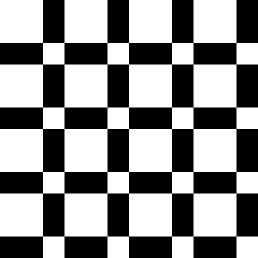
On most natural photographs the difference is subtle — modern libraw’s “linear” mode is already pretty good, and ordinary scenes don’t contain sufficiently high frequency (near-Nyquist) content to stress it badly. To make the failure mode unmistakable, here’s a synthetic test. Imagine a perfectly black-and-white striped pattern, oriented at an angle so it doesn’t align with the Bayer tile. Sample it through a Bayer CFA, run the same naive bilinear demosaic, and look at what comes out:


The artefact differences are biggest where they’re easiest to see — high-contrast edges, fine repetitive textures, anything approaching the per-channel Nyquist limit. Smooth gradients survive even the simplest demosaic intact, which is why naive interpolation made it through several generations of consumer cameras before anything more sophisticated was deployed: most photos don’t really contain content fine enough to expose the failure. The ones that do (chain-link fences, tweed jackets, distant foliage, fine printed text) are the canonical “cameras choke on this” examples in image-processing literature.
3.5 Colour correction
The demosaic step gives back a full RGB triple per pixel, but those triples are still in the camera’s native colour space. Each camera’s filters have their own spectral sensitivities — what the X-T5 calls “red” is a slightly different band of wavelengths than what a Sony A7 or a Canon R5 calls “red”. Two cameras pointed at the same red apple, with the same WB and exposure, will record subtly different RGB numbers. Display the data as-is and the colours look “off” in a way that isn’t quite WB and isn’t quite saturation.
The fix is a 3×3 linear transform — the colour correction matrix (CCM) — that maps the camera’s native RGB to a standard colour space, conventionally sRGB:
$$ \begin{pmatrix} R’ \\ G’ \\ B’ \end{pmatrix} = \mathbf{M} \begin{pmatrix} R \\ G \\ B \end{pmatrix} $$
The coefficients are camera-specific. Manufacturers measure each sensor’s response under controlled illuminants, fit a matrix that minimises colour error against a reference target (typically a Macbeth ColorChecker), and ship those numbers in firmware or in DNG metadata. The matrix is illuminant-dependent — DNG files usually carry two CCMs, one for daylight (D65) and one for tungsten (StdA), with the actual matrix interpolated according to the WB-estimated colour temperature.


The shift is genuinely small for most natural content; you have to compare the two side-by-side to see it. But the cumulative effect across an image is part of what makes one camera body’s colour science look “warm and filmic” while another looks “cool and clinical”. The CCM is one important contributor; tone curves, hue twists, white-balance presets, and per-profile LUTs do most of the rest.
3.6 Tone mapping
The linear data after WB and demosaic still has a problem: its dynamic range exceeds what any conventional display can show. Bright sky values might be 10 or 30 or 100 times brighter than the maximum that can be displayed on your screen; deep shadow values are below the noise floor of the bit depth. Without an explicit fix, highlights blow out and shadows vanish.
The cheapest “fix” is to clip linear values at 1.0 and gamma-encode whatever remains. The proper fix is a tone-mapping operator — a function that compresses high values into the displayable range without clipping. The textbook example is global Reinhard, which at its heart is a single curve:
$$ y = \frac{x}{1 + x} $$
In mathematical terminology, it’s monotonic and bounded — every $x \in [0, \infty)$ maps to a $y \in [0, 1)$ — so highlights are preserved without ever crossing the display ceiling. But “$x$” here isn’t a per-channel RGB value. The operator is designed to act on luminance — a single brightness value per pixel — and the input has to be exposure-adjusted so the scene’s mid-tones land where the curve actually does useful work.
That exposure step is also what produces $x > 1$. §3.1’s $[0, 1]$ range was sensor-relative — $1$ meant photosite saturation, not display ceiling — and the gain applied here multiplies linear values so mid-tones land near perceptual middle grey ($\approx 0.18$ linear). For most scenes that gain is greater than one, which pushes scene highlights well past $1.0$: exactly the regime Reinhard is built to compress.
We won’t walk through the full implementation here (Bruno Opsenica’s tone-mapping primer is a good follow-on for the derivation), but applying it turns the dim, blown-out linear-clipped result into a properly-exposed image:


Reinhard is a textbook example. Production pipelines use richer curves — filmic operators that mimic the shoulder roll-off of photographic film, ACES tone-mapping for HDR-graded video, local operators that tone-map different regions of the image differently. They’re all answering the same question: how do you compress 100× of scene dynamic range into something the display can show, without losing the perceptual identity of the highlights or the shadows?
3.7 Gamma
The gamma transfer is the last step before the file is written. It has little to do with the camera, and only incidentally with the display’s physics — it’s fundamentally about human perception.
Human vision is approximately log-sensitive in luminance — equal visual steps correspond to multiplicative, not additive, intensity differences. Perceptual middle grey lands at roughly $0.18$ linear, not $0.5$: what the eye reads as a “halfway” tone carries less than a fifth of full radiance, because the eye is far more sensitive to relative changes in dim regions than in bright ones. Encoding linearly is wasteful: bits get spent on highlights where the eye can’t see the difference between $0.95$ and $0.96$, and starved from shadows where the eye easily distinguishes $0.01$ from $0.02$.
A gamma encoding redistributes the bits:
$$ y = x^{1/\gamma}, \qquad \gamma \approx 2.2 $$
![A plot of y = x (dashed) and y = x^(1/2.2) (solid red curve) over the range [0,1]. The curve sits well above the dashed line for small x, meaning low input values are lifted into the middle of the encoded range.](/images/writing/isp/gamma-curve.svg)
What the actual sRGB encoding standard uses is a piecewise variant — a linear toe at the very dark end, then a power curve — but $y = x^{1/2.2}$ is a good approximation for most purposes.
Skip the gamma step entirely and the same linear data that displayed well after Reinhard tone-mapping crushes to near-black; apply the sRGB OETF and mid-tones land where the eye expects them:


Getting this transfer wrong — applying it twice, applying it in the wrong direction, mixing gamma-encoded and linear values without re-linearising — is a common class of bug in image-processing code. The data on disk in a JPEG or PNG is gamma-encoded. The data inside a tone-map or a blur filter has to be linear. Anything that crosses that boundary has to remember which side it’s on.
4. The whole pipeline, end to end
Seven steps. Sensor data is digitised (invisible, inside the sensor). The data is linearised so subsequent corrections operate on radiometrically-meaningful values. White balance is applied in the linear domain to neutralise the illuminant. The single-channel mosaic is demosaiced into three full channels. A 3×3 colour-correction matrix maps the camera’s native RGB to standard sRGB primaries. The dynamic range is compressed via a tone-map operator. The result is gamma-encoded for display.
Together, that’s the difference between an array of numbers and a photograph:


In practice, real ISPs do far more — hot-pixel suppression, denoising (before demosaic, while statistics are tractable), local tone mapping (different curves in different regions), colour correction matrices (camera-specific calibration to a standard colour space), sharpening, lens-shading correction (correcting vignetting — the roughly-quadratic fall-off of light away from the sensor’s centre), sometimes temporal merging across frames, and more. Each of those is its own variation on the same theme: identify a specific way the captured signal misrepresents the scene, write a correction that fixes that one thing, sequence the corrections so each operates on the right form of the data.
The skeleton — the seven steps above — is the same across camera-style colour imaging stacks: phone cameras, mirrorless bodies, point-and-shoots, astrophotography rigs that target a display-ready render. Other domains diverge: medical scanners almost never demosaic or apply a CCM; ML pipelines that consume RAW frames frequently skip tone-mapping and gamma deliberately, to keep the data linear for the model. The common shape is “sensor sees one thing, observer expects another, and a deliberate sequence of corrections gets from one to the other” — which corrections, and in what order, depends on what the observer is.